
Have you ever wanted to animate something in a very specific way, but the properties available to you don’t quite cut it? Well here’s a way to animate using a sprite sheet and a “cropped div.”
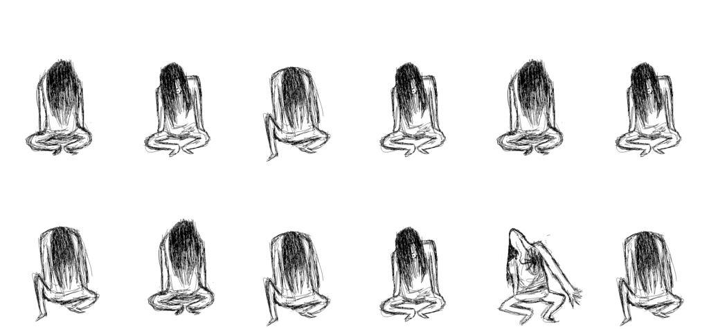
Here it is in action, and can be seen live here (activating on hover).
As a side-note, I thought of doing this because recently on the podcast syntax (episode 176) Drew Conley talks about his recent game Danger Crew, which is entirely built within React. He mentions using cropped divs as a way to animate the characters walking around, so I was inspired and tried to do it myself.
I found my results to be quite satisfying, and not that hard to do at all. I decided to use a sprite sheet I made some time ago:
My first approach was to use two nested divs, and to set a background-image and size on the inner div. My css for that looked like:
/* Outer div */
.character {
  width: calc(3010px / 6);
  height: calc(1400px / 2);
  background-color: #EF414C;
  transform: scale(0.5);
  position: absolute;
  left: 0;
  top: 0;
}
/* Inner div */
.character-sheet {
  width: 100%;
  height: 100%;
  background: url('../assets/spritesheet.png');
  background-position-x: calc(3010px / 6);
  background-position-y: 0;
  animation: character-sheet-anim 1s infinite steps(1);
}
The result it produced was more or less the same, but I found that animating into a second row was quite a pain. Already the keyframes were quite messy, so I didn’t bother going further or refining what I had.
@keyframes character-sheet-anim{
  0% {
    background-position-x: calc(3010px / 6);
  }
  16% {
    background-position-x: calc(3010px / 6 * 2);
  }
  32% {
    background-position-x: calc(3010px / 6 * 3);
  }
  48% {
    background-position-x: calc(3010px / 6 * 4);
  }
  64% {
    background-position-x: calc(3010px / 6 * 5);
  }
  80% {
    background-position-x: calc(3010px / 6 * 6);
  }
  96% {
    background-position-x: calc(3010px / 6);
  }
}
Another problem I had with this method was scaling. I could easily use transform: scale(); but that keeps the original footprint size, so it was awkward. Scaling the inner div / background sizes was too much of a hassle to be worth it.
My second method was a bit like the same, but instead the inner div just has an image tag of the sprite sheet. Using position and overflow:hidden provided a way to “crop” the inner sprite sheet div. My code in the end was:
.crop {
  width: calc(501px/2);
  height: calc(700px/2);
  overflow: hidden;
  background-color: #EF414C;
  position: relative;
  left: -50px;
  top: 150px;
}
.inner {
  height: 700px;
  width: calc(3010px / 2);
  position: absolute;
  left: 0;
  bottom: 0;
  animation: character-sheet-anim-position 2s infinite steps(1) forwards;
}
One thing to note here, is that I easily scaled the image size just by changing both overall sizes (outer is individual frame size, and inner is total size). Then using keyframes to move the left / bottom values:
@keyframes character-sheet-anim-position{
  0% {
    left: calc(0);
    bottom: -350px;
  }
  8% {
    left: calc(-250px);
  }
  16% {
    left: calc(-250px * 2);
  }
  24% {
    left: calc(-250px * 3);
  }
  32% {
    left: calc(-250px * 4);
  }
  40% {
    left: calc(-250px * 5);
  }
  48% {
    left: 0;
    bottom: 0;
  }
  56% {
    left: calc(-250px);
    /* bottom: 700px; */
  }
  64% {
    left: calc(-250px * 2);
    /* bottom: 700px; */
  }
  72% {
    left: calc(-250px * 3);
    /* bottom: 700px; */
  }
  80% {
    left: calc(-250px * 4);
    /* bottom: 700px; */
  }
  88% {
    left: calc(-250px * 5);
    /* bottom: 700px; */
  }
  96% {
    left: 0;
    bottom: -350px;
  }
}
Here it is without overflow: hidden:
An important thing option to note in both of these methods is within the animation property. There’s a little thing called steps(1). This is a value that replaces animation timings (such as linear or ease-in-out). The value of 1 indicates that there should only be 1 steps between each frame, meaning the values jump from value to value, instead of having a smooth transition. Mozilla has an example that shows it off here.
The application of this might be a bit niche, but it would allow for a designer or artist to create a more handcrafted animation for a website. CSS can be powerful but limited and finding tricks like this can be a cool tool to pull out if needed.
Thanks for reading, and leave a comment if you found this interesting!