Human Music

Human music is a term that I just made up. I’m sure people have talked about this subject before, and probably in much better detail; however, I still want to give my thoughts about it. At the very least to put my thoughts on a page somewhere.

So what do I mean when I say Human music? I mean music where I can tell there’s a person behind the song. That there was emotion put into it and the singer felt something while recording.

This is probably a bit pretentious, and can apply to lots of different music, but it’s my favourite kind and isn’t limited to one genre. Maybe using the term Human is a bit too much, as music we know is mainly made by humans, so I also like the term raw, or emotional music.

My first encounter with this kind of music must have been the Japanese Hip Hop / Rap artist 不可思議wonderboy.

While the music sound isn’t very refined, there’s clear emotion behind the words.

Another artist I really like, who I found through 不可思議wonderboy is ともちゃん9さい (Tomo Chan 9). Who I’d describe as a spoken word artist. Here’s a tribute she did with 不可思議wonderboy:

Most of the music I’ve found that really hooks me in with this aspect is non-English and usually by lesser-known artists.

One of my favourite artists, with a bit of a irregular name, is the band Crywank, they’re a two person band and have existed for around 8 years so far. Crywank is a DIY band, so there’s less production value and that adds to the rawness of the vocals.

I think one of the biggest contributing factors to it being human music is that the lyrics are relatable on a sad emotional level.

Here is a recent live recording they’ve done, with all amazing songs:

And you can compare their earlier work with one of the original songs:

https://www.youtube.com/watch?v=4tMMbSAloZE

My favourite part about their music is the evolution of lyrical themes, moving from teen angst about love to adult life and worries.

Switching to a band that’s a bit more intense, Ezra Furman. Their music is more produced and ‘standard’ but just as raw and full of emotion:

Once again, they’re dealing with topics that are more personal and that they as a vocalist have an emotional attachment to.

There’s also some artists that will use samples from movies or shows. These samples can be from emotional moments and that adds a touch of humanity. One example is the beginning of this song:

While only a little bit of that song I would describe as Human music, it’s still there.

Of course there are many different artists that will fit into this type. It’s hard to describe why I feel such a strong connection to songs like these. Maybe it’s the idea that the singer has gone through emotional turbulence – something everyone can relate to, and that allows us to feel not alone and release some pent up emotions.

Here is a spotify playlist that has the artists I mentioned, plus a couple others.

If you know of any similar music, please let me know! I love finding new music to listen to.

Effective Laziness – Web Dev

Writing repetitive code is usually not very much fun. So finding the best way to cut this down can be a huge time-saver and thankfully vsCode- and other IDEs – have major saving graces called Snippets.

If you want to skip reading all of this, you can just checkout some of my snippets here!

Snippets and Emmet!

Visual Studios Code already comes with a bunch of handy shortcuts that speedup project setup, and make creating the boilerplate for a website come to mere seconds.

In comes the amazing: !
This sets up the basic HTML5 structure, and even includes the proper meta tag enabling responsive design.

<!DOCTYPE html>
<html lang="en">
<head>
  <meta charset="UTF-8">
  <meta name="viewport" content="width=device-width, initial-scale=1.0">
  <meta http-equiv="X-UA-Compatible" content="ie=edge">
  <title>Document</title>
</head>
<body>
  
</body>
</html>

Now that’s what I call fast.

Likewise, we can use emmet to speed up typing boilerplate code we know we’re going to write. For example, writing:

header>div.wrapper>h1+nav>ul>li*5>a

will let you create the simple header structure of:

<header>
  <div class="wrapper">
    <h1></h1>
    <nav>
      <ul>
        <li><a href=""></a></li>
        <li><a href=""></a></li>
        <li><a href=""></a></li>
        <li><a href=""></a></li>
        <li><a href=""></a></li>
      </ul>
    </nav>
  </div>
</header>

These are great, but they’re also just the tip of the iceberg. As I’ve been writing more and more code, I keep noticing code that I need to re-write every project, sometimes multiple times per project.

So, I’ll quickly just cover what snippets I’ve used in many different projects.

Commenting

"Create Start Of Div Comment": {
	"prefix": "s-o-d",
	"body": "<!-- Start of $1 Div -->",
	"description": "Create a Comment"
},
"Create End Of Div Comment": {
	"prefix": "e-o-d",
	"body": "<!-- End of $1 Div -->",
	"description": "Create a Comment"
}
"Create an HTML reminder comment": {
	"prefix": "reminder",
	"body": "<!-- !!!! TO DO: $1 !!!! -->",
	"description": "Create a comment that will shout at you to do something",
	"scope": "html"
},
"Create a CSS reminder comment": {
	"prefix": "reminder",
	"body": "/* !!!! TO DO: $1 !!!! */",
	"description": "Create a comment that will shout at you to do something",
	"scope": "css,scss"
}

One thing to note here, is that snippets in a custom .code-snippets file can contain the “scope” parameter. This restricts the snippet to only be recognized in those file types. Super handy if you need it in multiple file types.

React

React has some fairly intense boilerplate code that needs to be written. So to shortcut that, snippets are great.

"React Axios": {
	"prefix": "r-axios",
	"body": [
		"axios({",
		"\tmethod: 'GET',",
		"\turl: '',",
		"\tdataResponse: 'json',",
		"\tparams: {",
		"\t\tkey:'',",
		"\t}",
		"}).then( (result) => {",
		"\t",
		"}).catch( (error) => {",
		"\t",
		"});"
	],
	"description": "React axios call",
	"scope": "javascriptreact, javascript"
},
"React Class": {
	"prefix": "r-class",
	"body": [
		"class $1 extends React.Component {",
		"\tconstructor() {",
		"\t\tsuper();",
		"\t\tconsole.trace(`This has an unused constructor!`);",
		"\t}",
		"\tcomponentDidMount() {",
		"\t\t",
		"\t}",
		"\trender() {",
		"\t\treturn(",
		"\t\t\t<>",
		"\t\t\t\t",
		"\t\t\t</>",
		"\t\t);",
		"\t}",
		"};",
		"",
		"export default $2;"
	],
	"description": "Create a react class with the basic lifecycle methods",
	"scope": "javascriptreact, javascript"
},
"React Ternary": {
	"prefix": "r-?:",
	"body": [
		"{ ",
		"\t$1",
		"\t\t? $2",
		"\t\t: $3",
		"}"
	],
	"description": "Create a ternary thingamajig",
	"scope": "javascriptreact, javascript"
},
"React Map": {
	"prefix": "r-map",
	"body": [
		"{", 
		"\t$1.map( (item) => {",
		"\t\treturn <div>{item}</div>",
		"\t})",
		"}"
	],
	"description": "Create a map for react",
	"scope": "javascriptreact, javascript"
},
"React Import": {
	"prefix": "import-react-component",
	"body": "import React from 'react';",
	"description": "The important import statement",
	"scope": "javascriptreact, javascript"
}

Font-Awesome

Font awesome is an amazing resource, and it’s great for quick icons. So why not make that even faster? We just need the base kit CDN, and then can freely link other icons. I’ve added a bunch if icons that I regularly use, so it’s quite a big file now.

"Font Awesome Kit" : {
	"prefix": "font-awesome-kit",
	"body": "<script src='<your-kit-link>' crossorigin='anonymous'></script>",
	"description": "Font awesome icon for ",
	"scope": "html"
}

And then just have your icon snippets:

"Square Icon" : {
	"prefix": "font-awesome-square",
	"body": "<i class='far fa-square'></i>",
	"description": "Font awesome icon for a square",
	"scope": "html, javascriptreact, javascript"
},
"Check Square Icon" : {
	"prefix": "font-awesome-square-check",
	"body": "<i class='far fa-check-square'></i>",
	"description": "Font awesome icon for a checked square",
	"scope": "html, javascriptreact, javascript"
}

And I like having a blank template at the bottom of my snippet file, to easily add more icons:

" Icon" : {
	"prefix": "font-awesome-",
	"body": "<i class='fa$1 fa-$2'></i>",
	"description": "Font awesome icon for ",
	"scope": "html, javascriptreact, javascript"
}

One of the especially nice things about snippets, is that you don’t even need to write out the whole thing! You just need to write out the starting letters of each word, so for a square – “fasq” and for a square with a check – “fasqc.”

Snippets are powerful because you can customize them to be however you want! They can be simple, they can be complex, they can save a couple words. But that all adds up, and personally I’d rather thinking about what to type, rather than typing it!

CSS sprite sheet animation

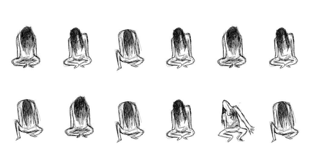
Have you ever wanted to animate something in a very specific way, but the properties available to you don’t quite cut it? Well here’s a way to animate using a sprite sheet and a “cropped div.”

Here it is in action, and can be seen live here (activating on hover).

As a side-note, I thought of doing this because recently on the podcast syntax (episode 176) Drew Conley talks about his recent game Danger Crew, which is entirely built within React. He mentions using cropped divs as a way to animate the characters walking around, so I was inspired and tried to do it myself.

I found my results to be quite satisfying, and not that hard to do at all. I decided to use a sprite sheet I made some time ago:

My first approach was to use two nested divs, and to set a background-image and size on the inner div. My css for that looked like:

/* Outer div */
.character {
  width: calc(3010px / 6);
  height: calc(1400px / 2);
  background-color: #EF414C;
  transform: scale(0.5);
  position: absolute;
  left: 0;
  top: 0;
}
/* Inner div */
.character-sheet {
  width: 100%;
  height: 100%;
  background: url('../assets/spritesheet.png');
  background-position-x: calc(3010px / 6);
  background-position-y: 0; 
  animation: character-sheet-anim 1s infinite steps(1);
}

The result it produced was more or less the same, but I found that animating into a second row was quite a pain. Already the keyframes were quite messy, so I didn’t bother going further or refining what I had.

@keyframes character-sheet-anim{
  0% {
    background-position-x: calc(3010px / 6);
  }
  16% {
    background-position-x: calc(3010px / 6 * 2);
  }
  32% {
    background-position-x: calc(3010px / 6 * 3);
  }
  48% {
    background-position-x: calc(3010px / 6 * 4);
  }
  64% {
    background-position-x: calc(3010px / 6 * 5);
  }
  80% {
    background-position-x: calc(3010px / 6 * 6);
  }
  96% {
    background-position-x: calc(3010px / 6);
  }
}

Another problem I had with this method was scaling. I could easily use transform: scale(); but that keeps the original footprint size, so it was awkward. Scaling the inner div / background sizes was too much of a hassle to be worth it.

My second method was a bit like the same, but instead the inner div just has an image tag of the sprite sheet. Using position and overflow:hidden provided a way to “crop” the inner sprite sheet div. My code in the end was:

.crop {
  width: calc(501px/2);
  height: calc(700px/2);
  overflow: hidden;
  background-color: #EF414C;
  position: relative;
  left: -50px;
  top: 150px;
}
.inner {
  height: 700px;
  width: calc(3010px / 2);
  position: absolute;
  left: 0;
  bottom: 0;
  animation: character-sheet-anim-position 2s infinite steps(1) forwards;
}

One thing to note here, is that I easily scaled the image size just by changing both overall sizes (outer is individual frame size, and inner is total size). Then using keyframes to move the left / bottom values:

@keyframes character-sheet-anim-position{
  0% {
    left: calc(0);
    bottom: -350px;
  }
  8% {
    left: calc(-250px);
  }
  16% {
    left: calc(-250px * 2);
  }
  24% {
    left: calc(-250px * 3);
  }
  32% {
    left: calc(-250px * 4);
  }
  40% {
    left: calc(-250px * 5);
  }
  48% {
    left: 0;
    bottom: 0;
  }
  56% {
    left: calc(-250px);
    /* bottom: 700px; */
  }
  64% {
    left: calc(-250px * 2);
    /* bottom: 700px; */
  }
  72% {
    left: calc(-250px * 3);
    /* bottom: 700px; */
  }
  80% {
    left: calc(-250px * 4);
    /* bottom: 700px; */
  }
  88% {
    left: calc(-250px * 5);
    /* bottom: 700px; */
  }
  96% {
    left: 0;
    bottom: -350px;
  }
}

Here it is without overflow: hidden:

An important thing option to note in both of these methods is within the animation property. There’s a little thing called steps(1). This is a value that replaces animation timings (such as linear or ease-in-out). The value of 1 indicates that there should only be 1 steps between each frame, meaning the values jump from value to value, instead of having a smooth transition. Mozilla has an example that shows it off here.

The application of this might be a bit niche, but it would allow for a designer or artist to create a more handcrafted animation for a website. CSS can be powerful but limited and finding tricks like this can be a cool tool to pull out if needed.

Thanks for reading, and leave a comment if you found this interesting!

A monumental pivot

Photo by Danielle MacInnes on Unsplash

Recently in between contracts I decided to look into web development. I talked to a family friend and found about HackerYou (now Juno College).

I learned that my development knowledge was lacking – I had all the parts but didn’t know how they all fit together. Taking an accelerated course helped me reach a new understanding and sparked a desire for more.

Game Design to Front-End Development

In my previous career of game design I worked a lot with Unity and really loved the scripting / programming side of the workflow. In my final year I made quite a few editor tools, and creating my own hitbox system. Solving logical problems is something that I’ve loved since an early age.

However, the design side of games was something that I found a bit tedious. Creating large sweeping ideas and planning out ideas was fun, but creating plans and technical documents wasn’t what interested me.

Bringing something to life, and seeing it work – that’s what I’m passionate about and want to do with my life. This is something that front-end development lets me do. Creating little parts and making it all work.
I hope to keep working on games in my spare-time, but for now will be placing that to the side.

So what’s the plan?

So after a summer of thinking and doing some contract work, I have now enrolled into Juno College’s immersive front-end development bootcamp. Nine weeks – 10am-6pm – five days a week.

After just one week, I’m already feeling the pressure, but it’s a good kind. Quickly expanding my knowledge and pushing my skills is exactly the kind of challenge I’ve been looking for, and it’s what I’m getting.

The future?

Photo by Drew Beamer on Unsplash

Other than lots of projects, long days, and hopefully not a lot of crunch, I’ll be able to enter the tech industry as a skilled junior front-end developer.

I’m excited to see what will come next and with how the tech industry is ever-evolving, who knows?

Developer Log: Shapes

This game started out as a couple sentences in my notebook for taking food orders.

Inspired by fast arcade games and a playing card aesthetic it was meant to be something small and quick to make. However, it has taken almost three years to complete.

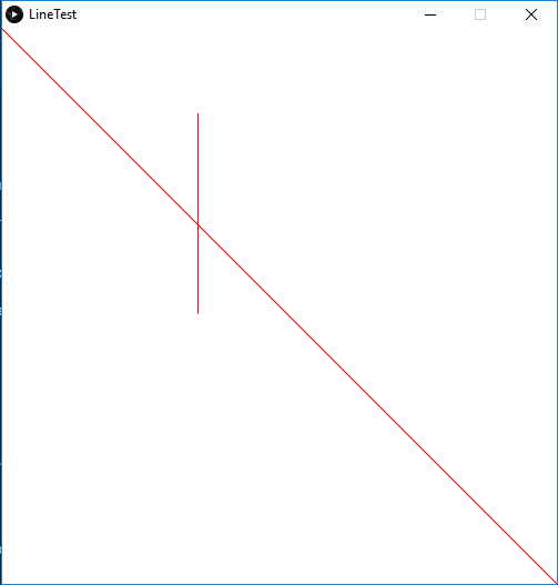
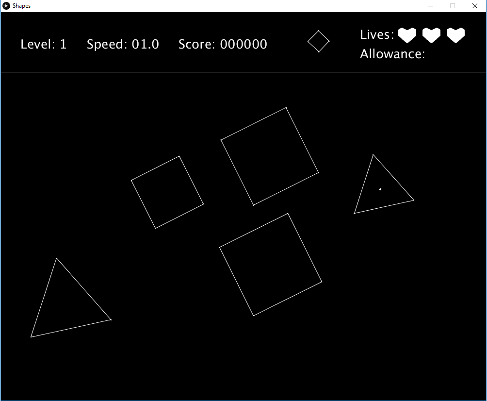
At first I was making it in processing, and trying to do everything with physics. I had a line test for intersection, and was using sine and cosine to create shapes.

It had a black and white minimalist look and was fairly complex.

The player had to place shapes within the shapes existing. Doing so would gain points, and give the player another shape. The difficulty came from the shapes spinning, and that they would spin faster and faster. Placing a shape where it would touch another shape would cause the player to lose a life. However, the player had an allowance for how many shapes they could place outside of another shape.

I ran into technical difficulties making this game, mainly because I hadn’t optimized how I was spinning the shapes, so too many would lag processing quite badly. It also lacked the speed I wanted to achieve, as placing the shapes was a lot harder due to the restriction of not touching another shape.

Shapes: Phaser

Recently I decided to start learning Phaser 3, a lightweight game framework that uses JavaScript. So making a simpler version of this game was something that came to mind immediately.

The main changes was where the difficulty was focused. Instead of accurate timing and placement, it comes from knowing what shapes are where and what is being placed. If the player is able to remember that, they can quickly place shapes and gain a much higher score.

The farther the player gets, the faster they need to go in order to gain any score at all.

The Queue

How I handled creating the queue was inspired by Tetris. According to this wiki – Tetris creates a queue of the seven tetrominoes and then randomizes them. This means that the player is guaranteed the same shape at least every 12 shapes. But because I have a queue of 3 shapes, it means that it’s impossible to be in a position where you need to think ahead and store a shape cleverly. You would never get 2 of the same shapes without getting 2 different ones before the 3rd.

So instead of randomizing a set of 3 shapes, I decided to go with a selection of 6 shapes, 2 of each kind, and after randomizing those picking the first 3. This means that a player might have to place 4 of the same shape in a row, meaning they have to think ahead and store a shape for in between them.

The Future

Some balancing may come into play, as I look over possible score outcomes and the way I create the queue for the shapes. As well as some simple bug fixes.

Developer Log: HMG – Overview

Horror Man Game

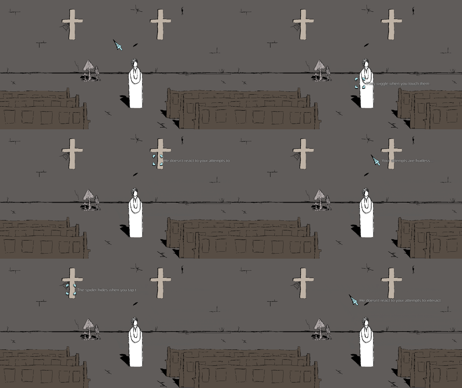
A working title for sure, but it gets the job done for me. A point and click adventure that will eventually be my first fully fledged game; a game that requires multiple systems to be functional. At the moment this includes:

  • An Inventory
  • Dialogue
  • A Map
  • Interactive Objects
  • Persistent Object States
  • Saving and Loading

My goal for this project is to learn methods of creating these systems. Not only the bare minimum, but trying my best to make them scalable and easy to use as a designer.

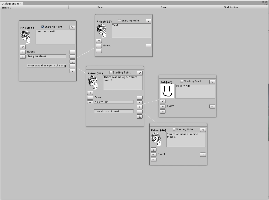
For example my current dialogue editor:

It’s functional and allows for branching choices in the conversation. It however, is not localisation friendly and doesn’t allow for editing outside of Unity.

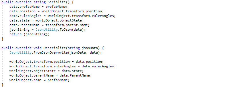
Currently my saving system uses Json serialization:

Not necessarily a bad thing, but unless I obfuscate the Json strings somehow, the user can muck about in their save data.

While developing further systems, I will document my technical thought process here, while maintaining a game wiki of sorts over here:

HMG Notion.So

Looking Back: Fishos

Design Inspiration

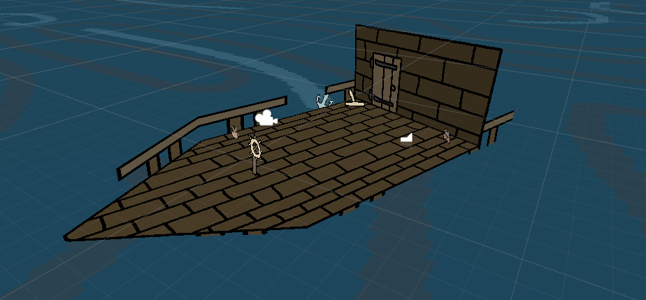
While Fishos is a game about fishing it didn’t start that way. The game was created for this game jam, using the theme of “Zodiac.” So what was the initial goal? For each zodiac – Aries to Pisces – all twelve of them, there was going to be a unique goal. Taking inspiration from Sea of Thieves, the player would have had to sail their ship around and solve riddles. Pisces required fishing, Gemini required lighting torches, and other such semi-related things.

Why didn’t that happen?

The game jam was a week long, and I was doing it solo. Creating twelve unique mechanics was way too much for that time frame. Since I had a fishing rod drawn up, and in the player’s inventory I pivoted heavily.

I cut out:

  • Islands
  • Boat Anchoring
  • Inventory Management
  • Using items
  • Battle Mechanics
  • Balancing Rocks

Instead of each zodiac sign being a unique mechanic, they became unique fish. Each requiring you to sail to a specific constellation and fishing until you caught it.

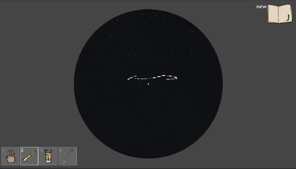
The starry sky

The Journal

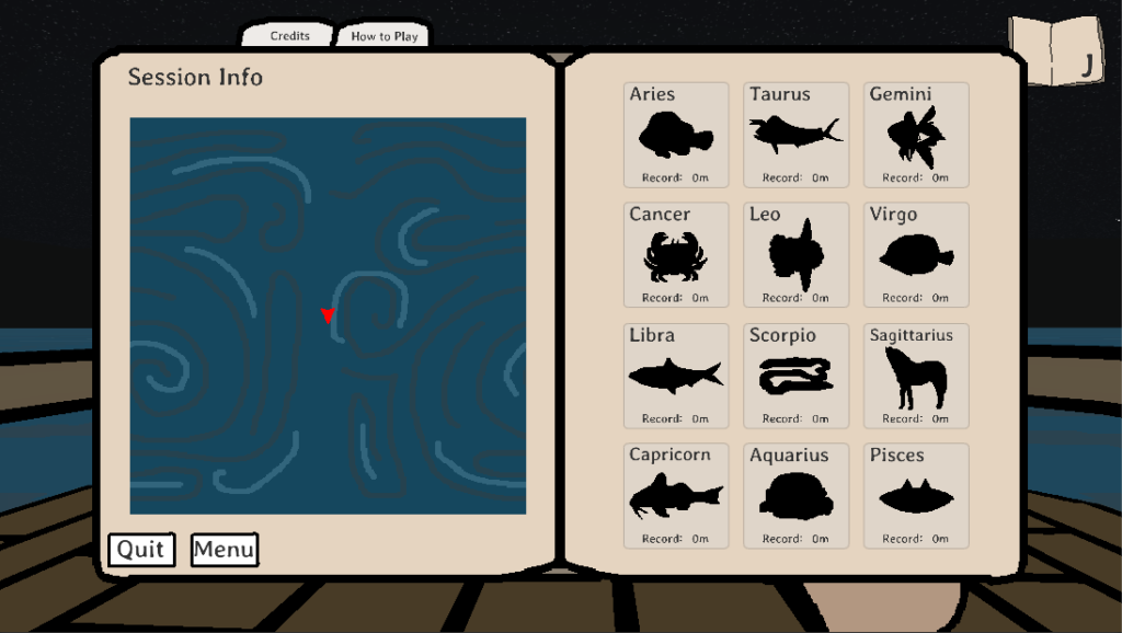
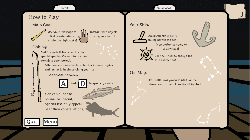
I think the most interesting aspect of the game was the menu. It took the form of a journal, including the instructions, the credits, and records of the special fish.

At the start of the game, the journal has a “new” prompt,

and will open up to the How to Play section. With the intent of catching attention and teaching the player.

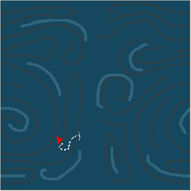
The map marker was actually easy to implement, and just required a “mapping” of the boat’s transform, but plays an essential role for positioning of the player.


RangeChange() is a function that I found online a while ago and it has been invaluable.

This only requires finding the new and old limits. Old being the values of the unity playspace: -1500 to 1500, both x and z. New being the UI limits of -165 to 165.

As the user approaches each sign, the journal will update with each constellation.

Scaling the World

One difficulty I faced was the scale of the game. How big is this ocean? How fast is the player’s boat? Top speed? Slow-down time? How “big” is each constellation?

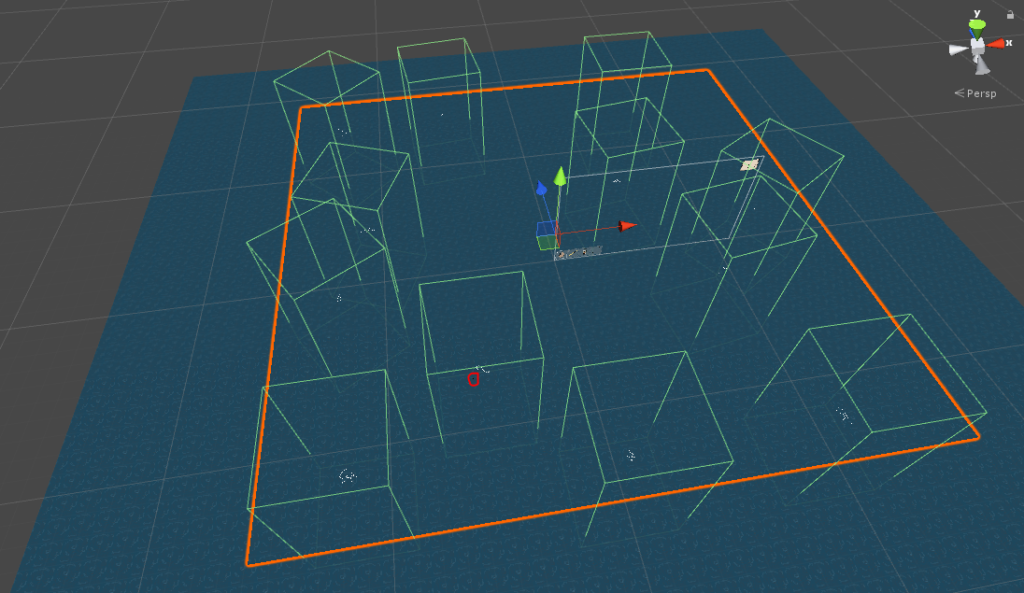
Having the world too big creates vast spaces of emptiness, but having it too small makes it not feel like an ocean. So I went with big. For a sense of final scale:

The tiny dot circled in red is the player’s ship. Each green collider box is a constellation. The full play space is 3000 Unity units in x and z.

The top speed is 0.3 which doesn’t feel like much, but because the water’s texture is small, the boat feels fast. The boat also wraps around the world, so getting to the next constellation is fairly easy.

To counteract overshooting a constellation, the boat slows five times faster than it speeds up.

Building the Ship

Like in my other game Long Live Freedom, which I talk about here I decided to create the 3D world out of sprites. From previous experience I already knew “best practices” to this approach and is done through visual trickery.

Each part is an individual sprite and is combined within Unity.

The only, and quite glaring issue with this was the shape of the ship. The triangle tip made creating colliders not an immediate solution kind of problem. I had to create other content, so I didn’t restrict the player movement.

Consider it either a bug, or a “walk-on-water” feature.

Hand Movement

The human hand. So versatile, so useful.

The biggest task for the hand and inventory items was creating believable movement. In simple terms, when the player is moving, have some swaying on the sprite that sort of mimics real life.

No movement on held items

No movement feels stiff and strange. A simple solution is present: Sine and Cosine waves. Combining them for x and y values, then slightly offsetting one will produce a figure 8 motion.

Scale controls the amplitude of the movement, so small means subtle motion. itemSwayTime is an important variable, because without it the hand will jump to a location. It keeps track of where in the wave the hand should be.

Using Tan() instead of Sin() can produce fun results, but not quite proper.

Using Tan()

The Results

In the end I’m quite satisfied with what I made. There are things to polish, but for a week by myself? I think it’s good.

The fishing mechanic could be improved; with it being a bit rushed and more of a mini-game than the focus.

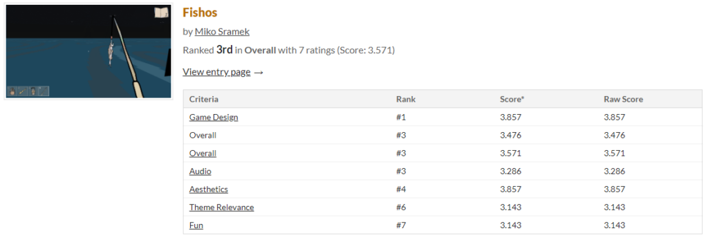
I didn’t place in the top 3 judged positions for the jam, but I did place 3rd out of 13 entries from user votes.

You can download the game from my itch page:

https://mikosramek.itch.io/fishos

Looking Back: Long Live Freedom

The Game

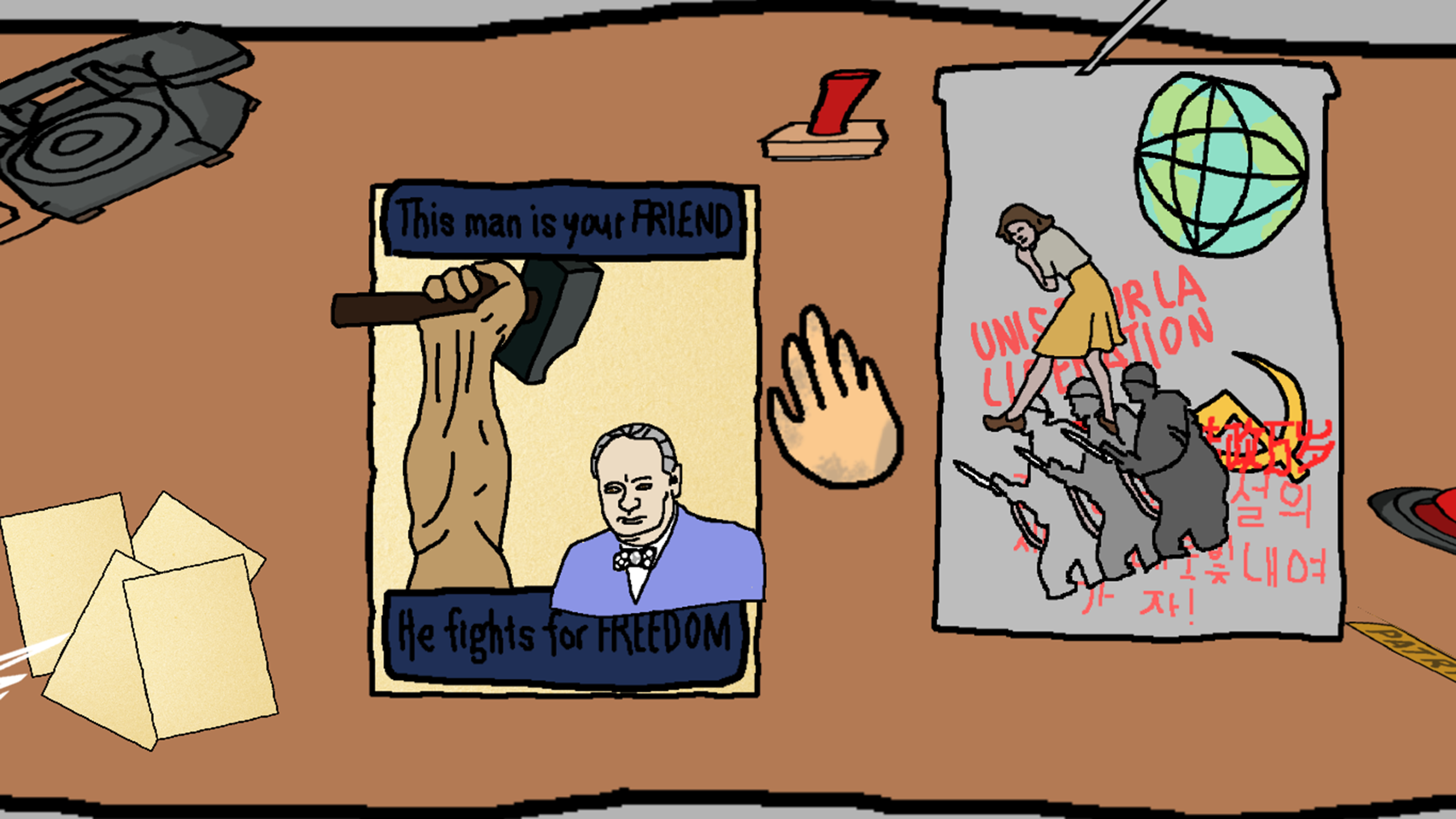
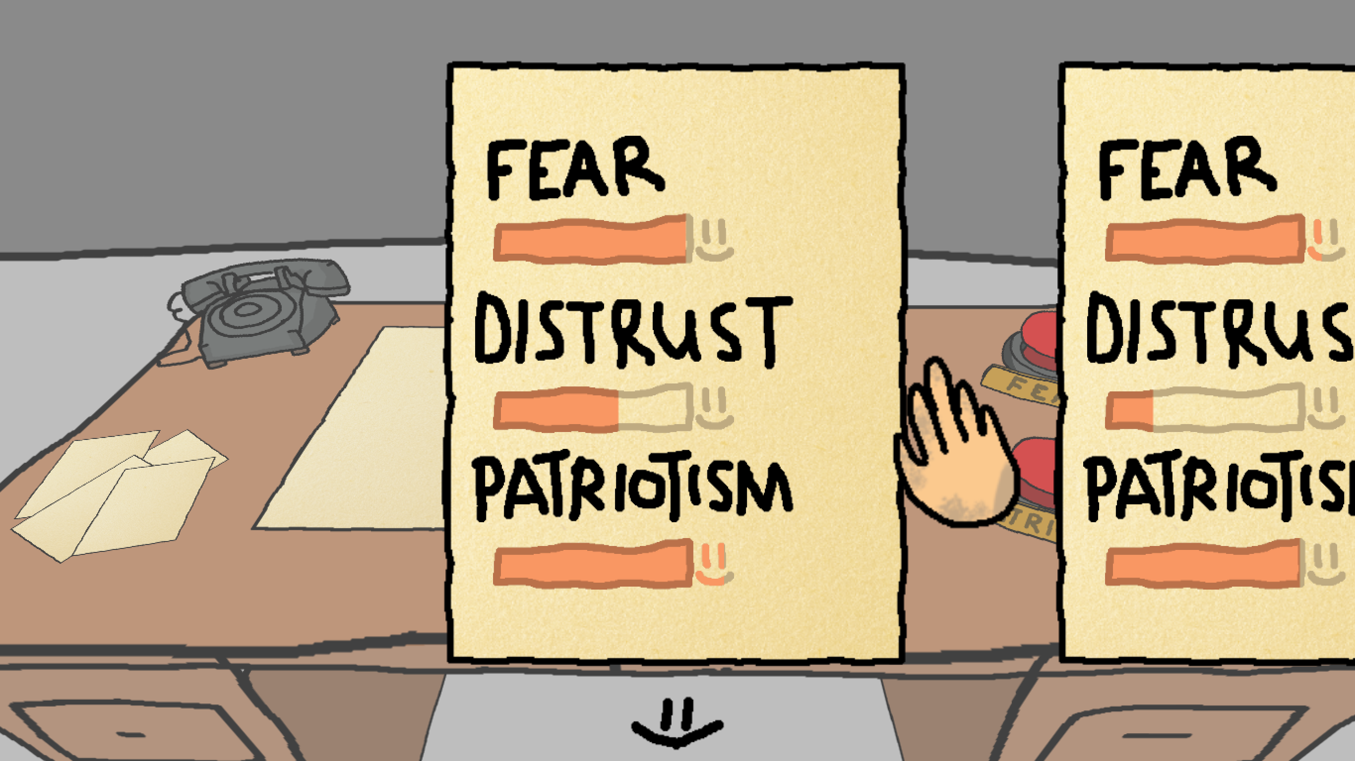
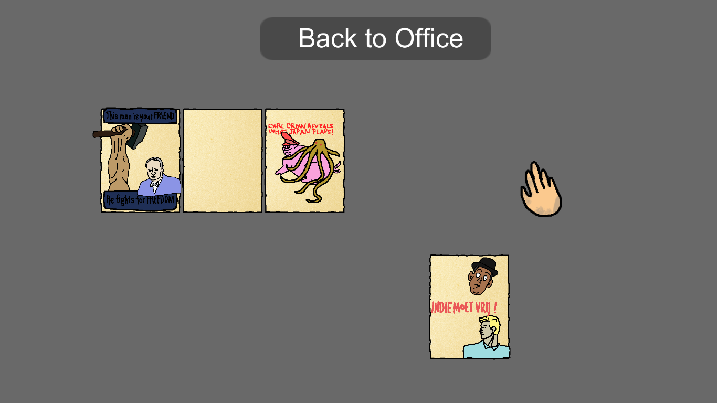
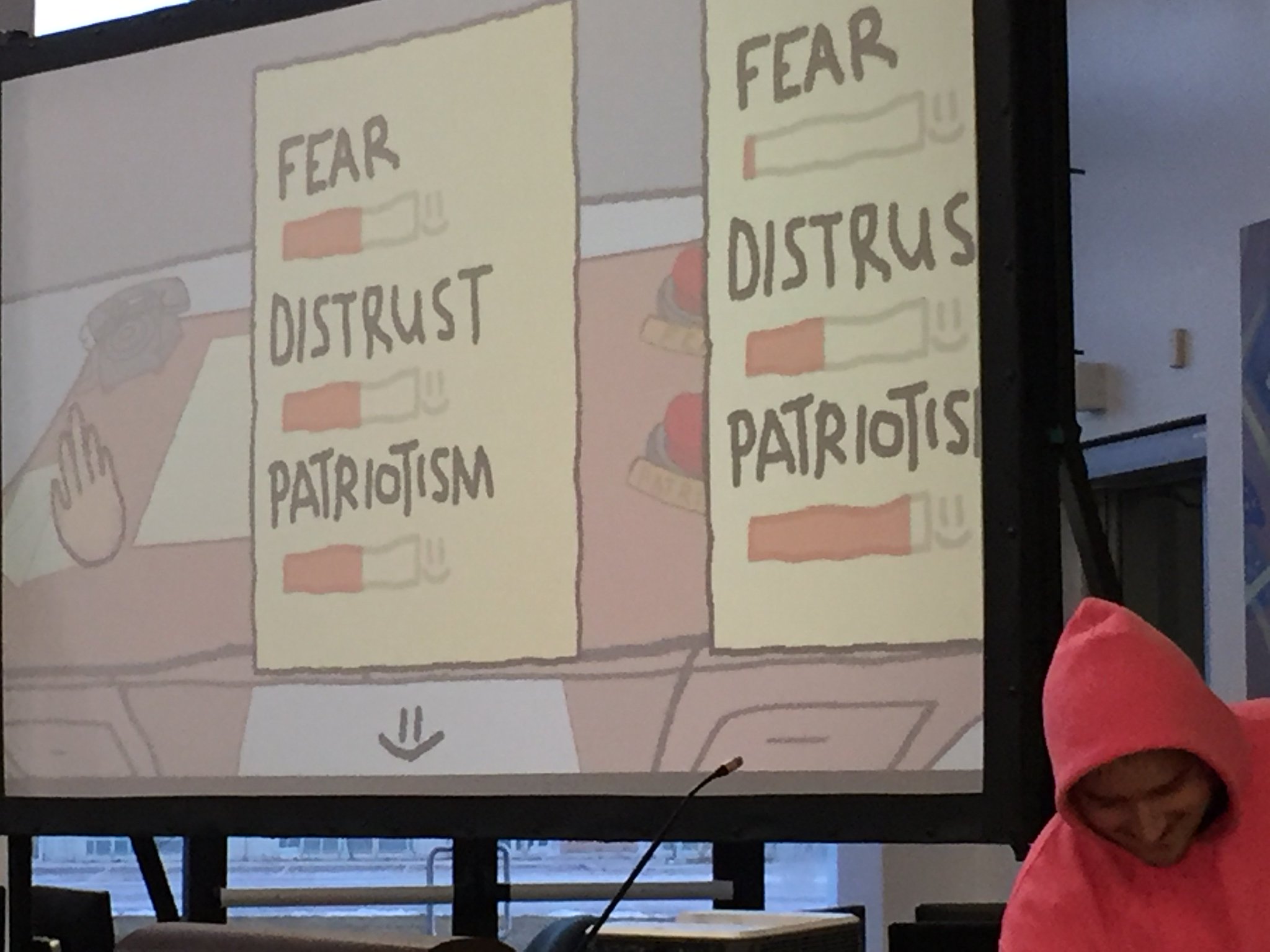
For reference, the game Long Live Freedom is about creating posters to change the states of Fear, Patriotism, and Distrust of other Countries within your country. This is done through daily posters created with different sets of imagery.

The very first poster ever made.

Initial Goals

This game was created for the 2018 Global Game Jam which was right in the middle of my fourth year at Sheridan. I was working on a fighting game at the time and I took this jam as a chance to clear my mind; to do something completely different. While it was stressful (I did it as a solo participant) it helped take my mind off of what was my current workload.

State of the game nearing the second night.

I went into the jam with the goal to create something small and strange. Not necessarily good, but would evoke thought. So when the theme was finally revealed to be “Transmission” I had quite a few ideas. I finally settled on transmission of ideas, which works quite well in the form of propaganda.

Thought Process

As I was going into this game jam solo, I had to prioritize what was important versus what wasn’t. As a singular person, you ideally need to deal with design, coding, art, and sound.

Overall design was done within the first few hours, mainly with the goal to provide guidance to my other decisions. As I was the only one creating the game all decisions were my say, which made discarding design decisions fairly easy. I didn’t have time to struggle with code or art to fulfill a design unless it was crucial.

For example, my initial designs included daily events that would have an outside effect upon the three stats the player had to balance.


Instead these pages just displayed how the player’s choices changed the stats.

Art and code can be crude as long as it gets the job done. Since most jam games get shelved, the code doesn’t need to be maintainable and features can be hacked together quickly.

Improvements

Looking back, or maybe forward, there are a couple improvements and features I would add.

  • Improved stat changes and events
    • Having these stats mean something would add more purpose to the game, having the player more interested in balancing them
    • Events allow for some more lore around the country and have the possibility to throw a monkey-wrench into the mix
  • A more aesthetic gallery
    • (See below) Having a better space for previous posters might improve the feeling of ownership for players
  • A more thought-out UI
    • The current UI was meant to be diegetic, being a part of the world through the phone on the table. This however is clunky and not the easiest to navigate
A lot more functional than good looking

In my opinion the main mechanic of creating posters outshines the act of balancing the stats. This can probably be attributed to the vagueness of the stats and how they have no real impact. Spending more time on how the three categories interact would have made it more of a game rather than an art piece.

I also have a bad habit of sacrificing my sanity for my desired aesthetic. I really enjoy the look of thick lined 2D pixel-esque art. In a 3D environment. Within Unity it’s possible and not that bad, but without uniform lines it can become a mess, and it a habit I should stop doing. Of course I do it again with my next solo game jam, 3 months later.

Showing off the game on the final day

Diving into VR development

I recently ordered an Oculus Rift, and once I become familiar with it I plan to try my hand at developing some simple games using it.

Image result for oculus rift
The Oculus Rift

Games to Research

The first step is to play what’s out there. Some games I plan to play for fun, but others just to see how VR has been handled. Since I haven’t really experienced VR for myself I’m curious as to how environments feel.

Games that have been made specifically for VR probably have the best experiences, but it’s also worth noting some games have adapted a VR mode.

Here’s a list of what I plan on playing.

Image result for Beat Saber
Image result for accounting+
Image result for vrchat
Image result for pavlov vr
Image result for elite dangerous steam

Questions to be answered

  • How are hands dealt with?
    • Are they controllers / models of hands?
    • Are there arms attached?
  • How much of a body does the player have / can be seen?
  • Can head height be adjusted?
  • Does head movement lag at all, is it one to one?
    • How much before it gets noticeable / dizzying?
  • How easy is it to use the keyboard while wearing the rift?
    • Specifically within Elite Dangerous
  • How does movement feel?
    • Is it continuous or is it point to point?

My KOJIKI54% Dev. Logs

I’m just about to graduate from Sheridan’s Bachelor of Game Design, and during our capstone I wrote six logs over the course of eight months. The game we made was a fighting game with an additional twist of having resource management. The project was difficult in both design and technical work.

It has been an interesting journey and something that’s been very valuable. As we’re wrapping up I’ve had the chance to look over the logs I’ve written and seeing the evolution of the game was quite something.

Anyways, as the logs had to be posted on another website, here are the links in order of my writing of them:

A Starting Point.

Creating a tool: the tech and design process.

Finding the utility of moves.

The Usage and Implementation of Fighting Resources.

Automation and Finding Bugs

Designing and Creating the Tutorial